Alles klar
Design graphique & Direction artistique
Lyon
contact@alles-klar-studio.com
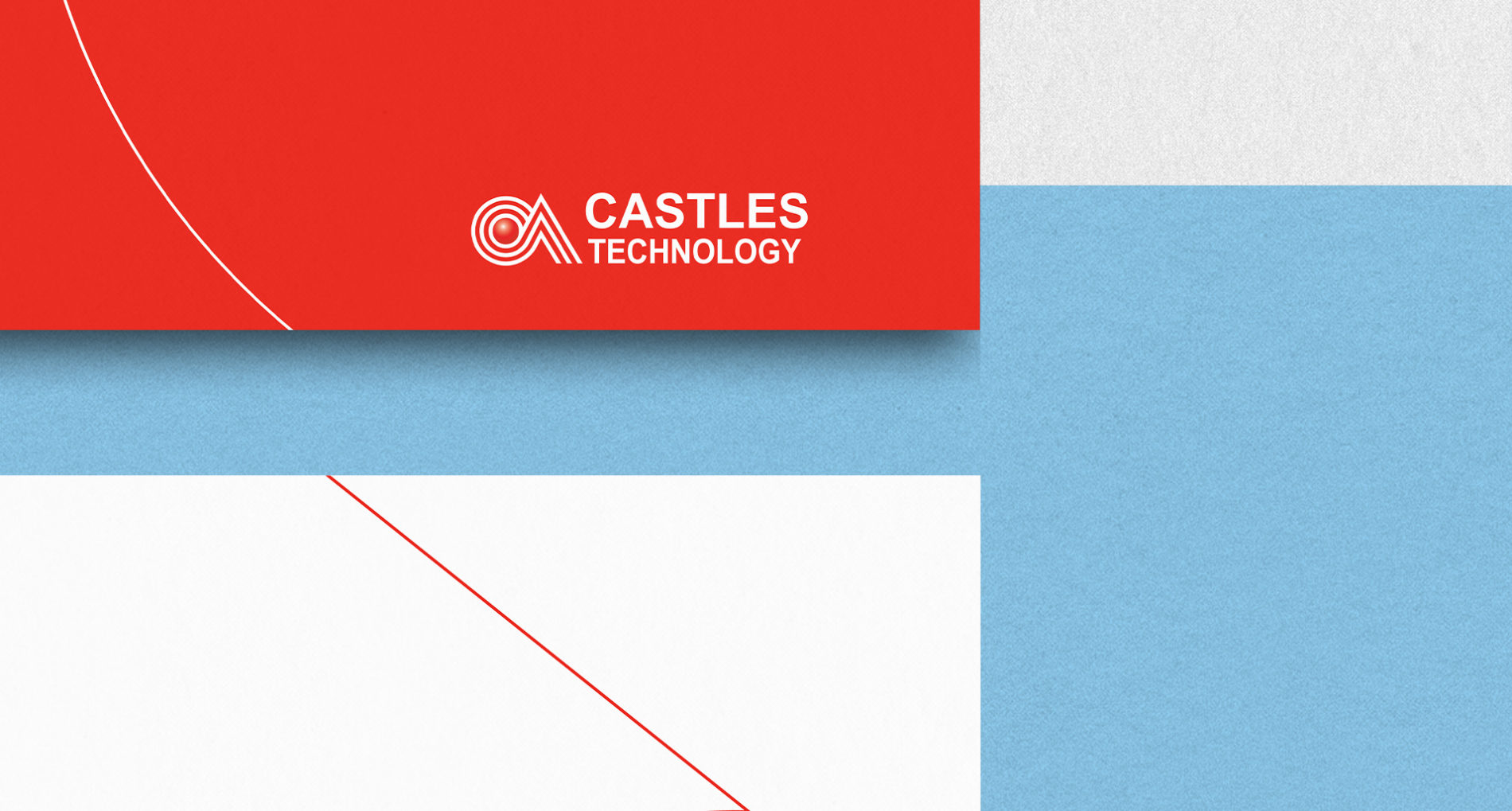
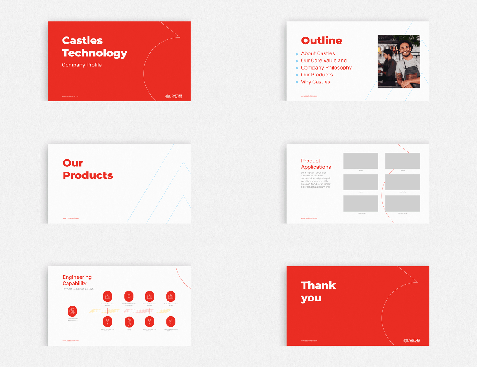
Producing the graphic charter of Castles, a payment terminal company for traders.
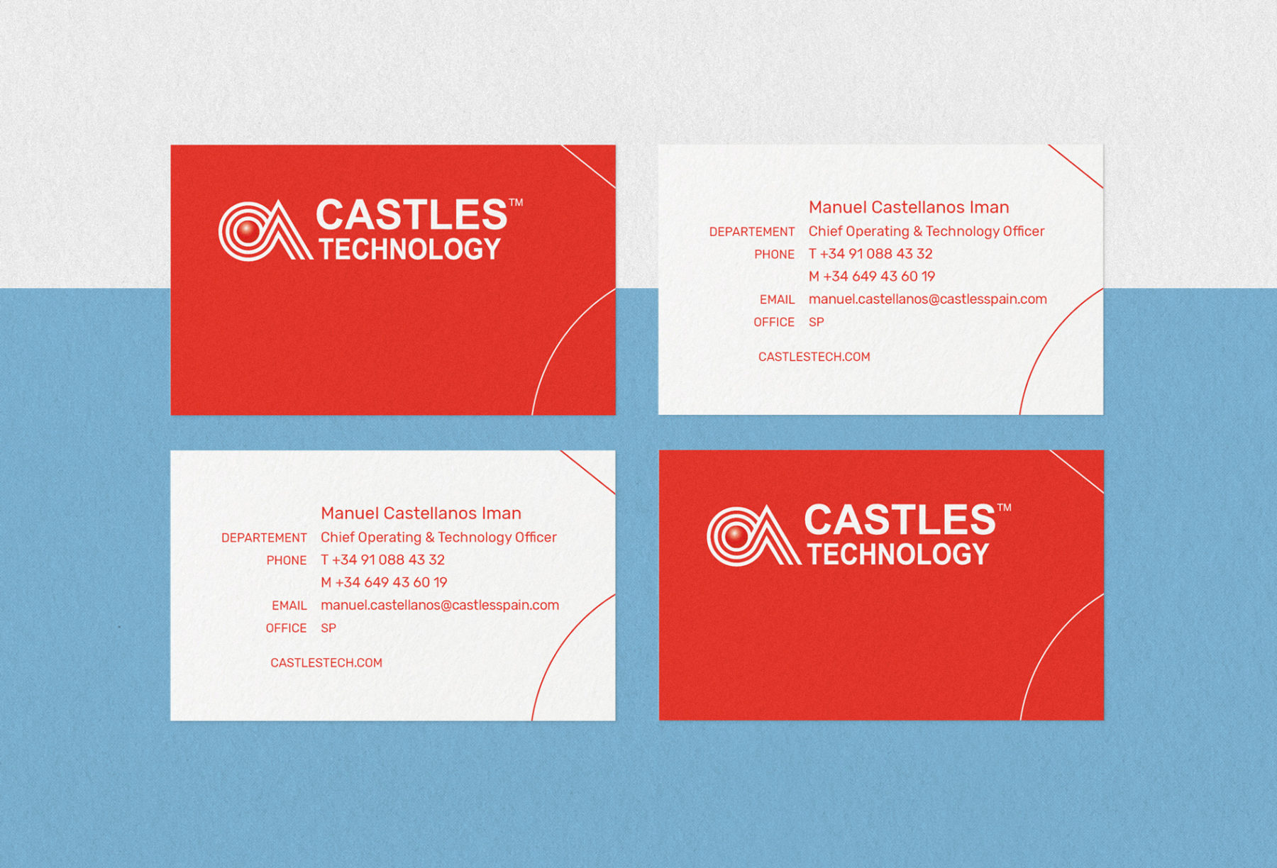
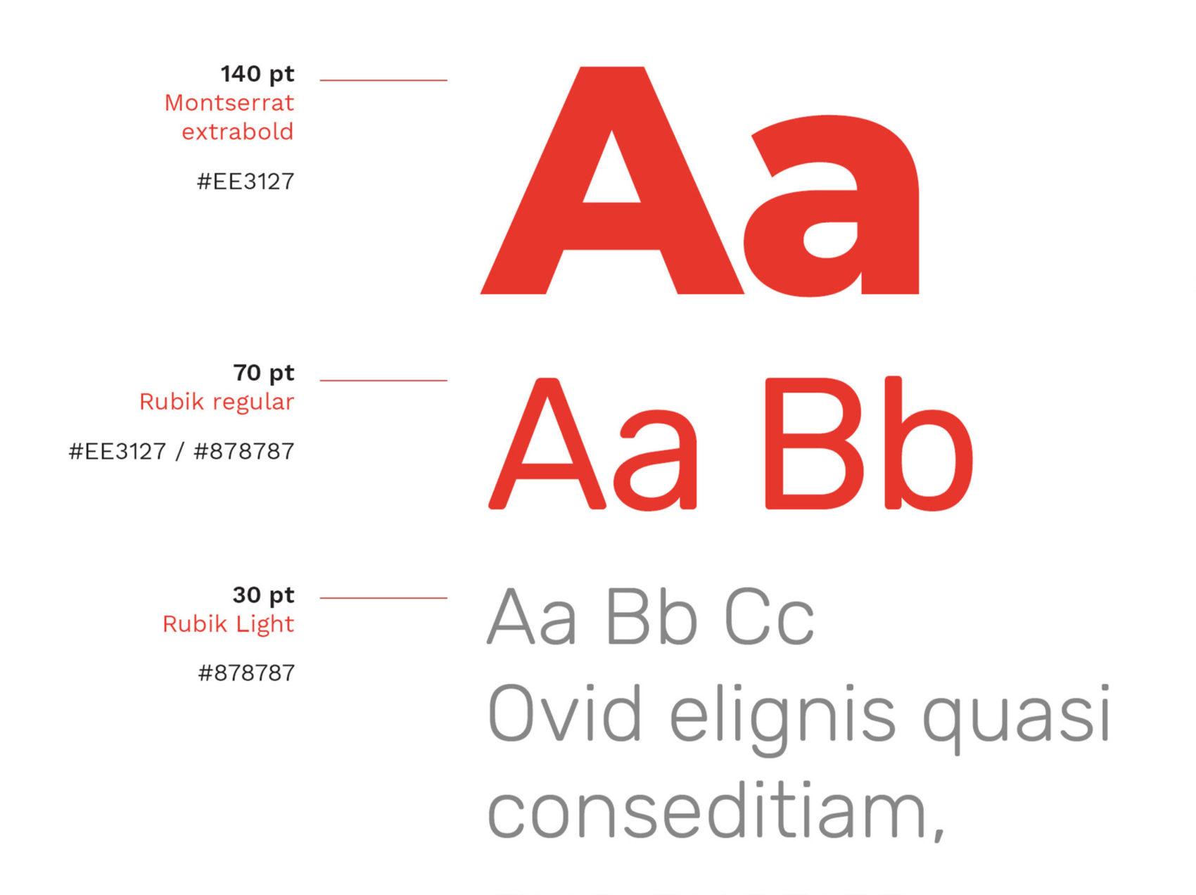
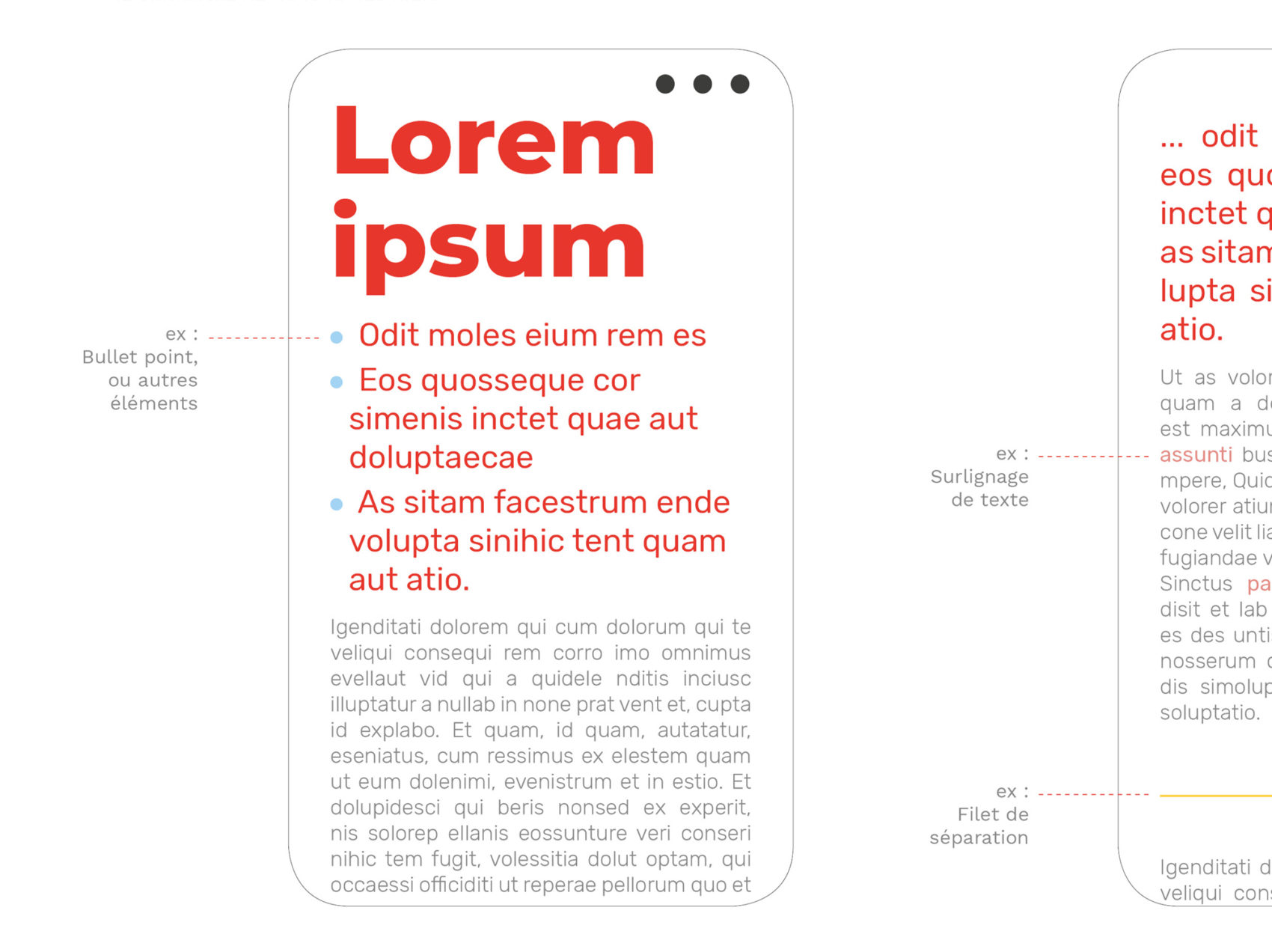
Implementing a clean and structured visual identity enabling the company’s team to apply its design principles with ease.
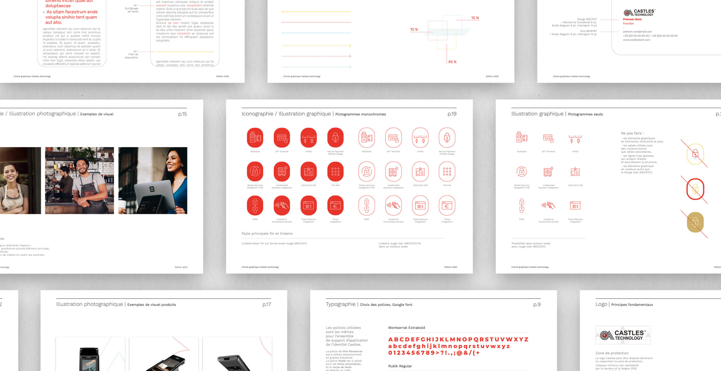
The angles and curves of the logo’s typeface are converted into wirelike shapes, which serve as the basis of the graphic charter’s visual language.
Its key colours, red and white, are supported by yellow, pink, and light blue tones.
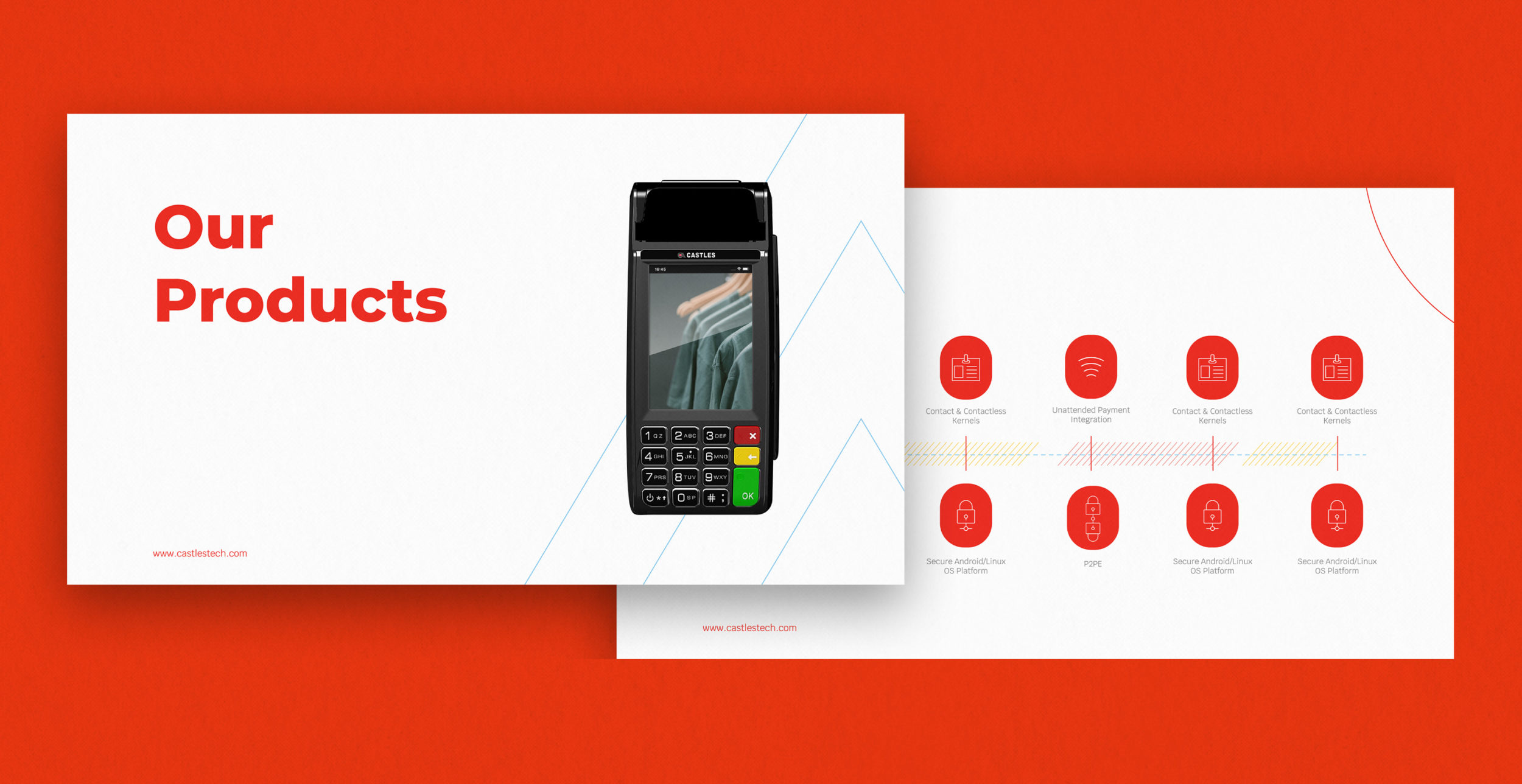
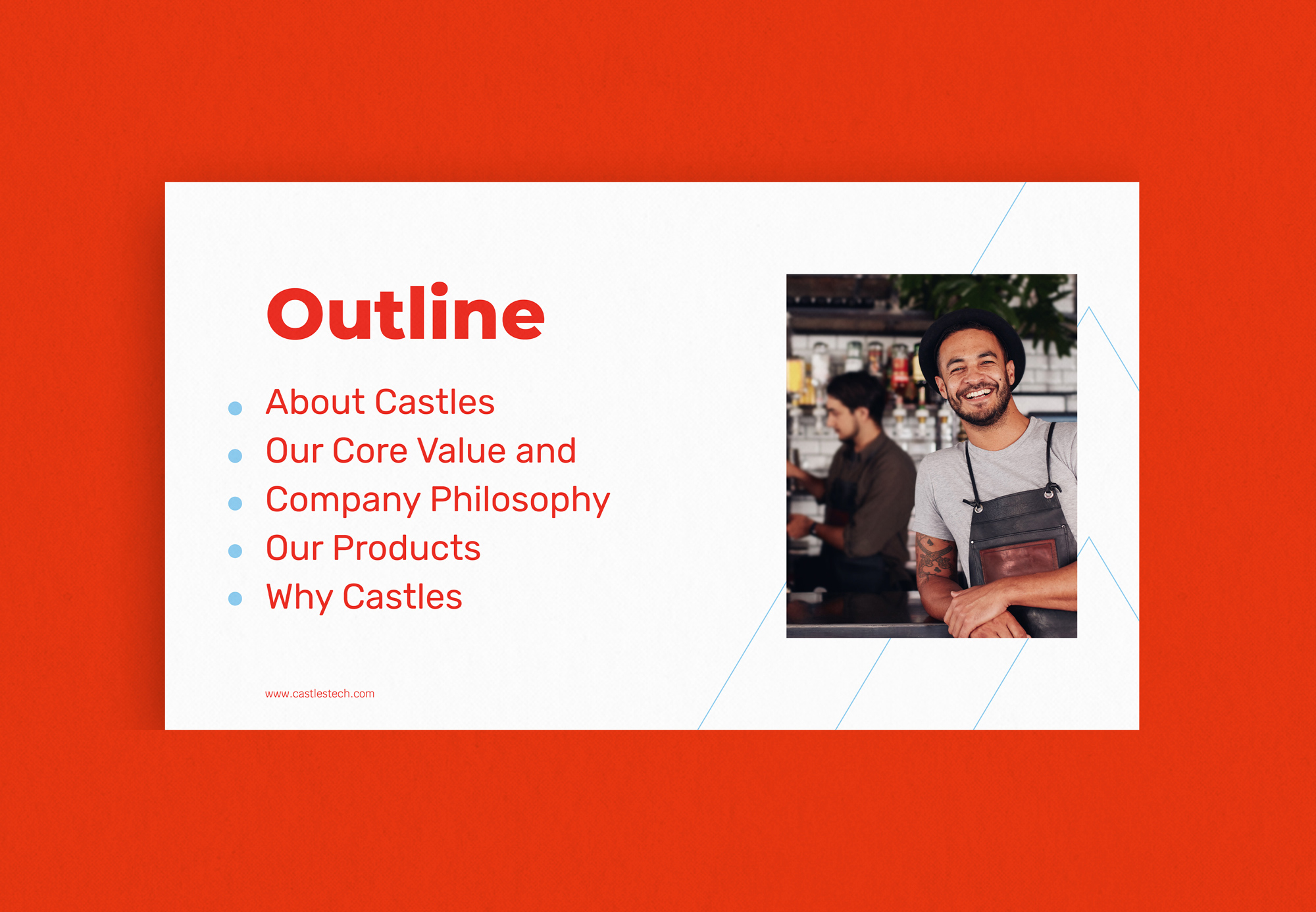
Project: Castles Technology
Categories: Visual identity, Art direction, Graphic charter
Client: Retrofutur Paris
Year: 2020