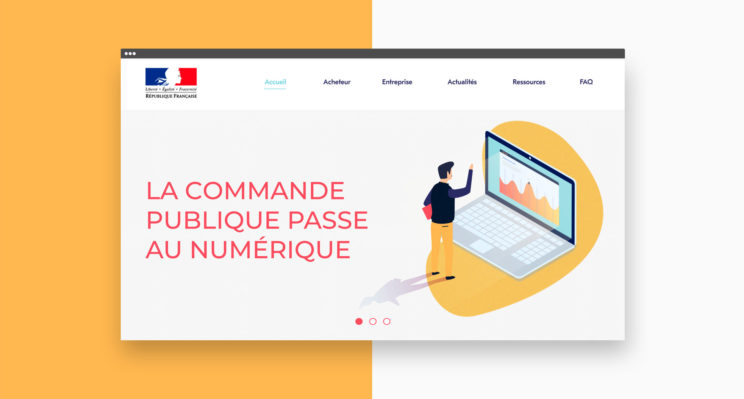
This online Platform was commissioned by the Interministerial Directorate for Public Transformation, the aim of which is to raise awareness of the digital transition of public procurement.
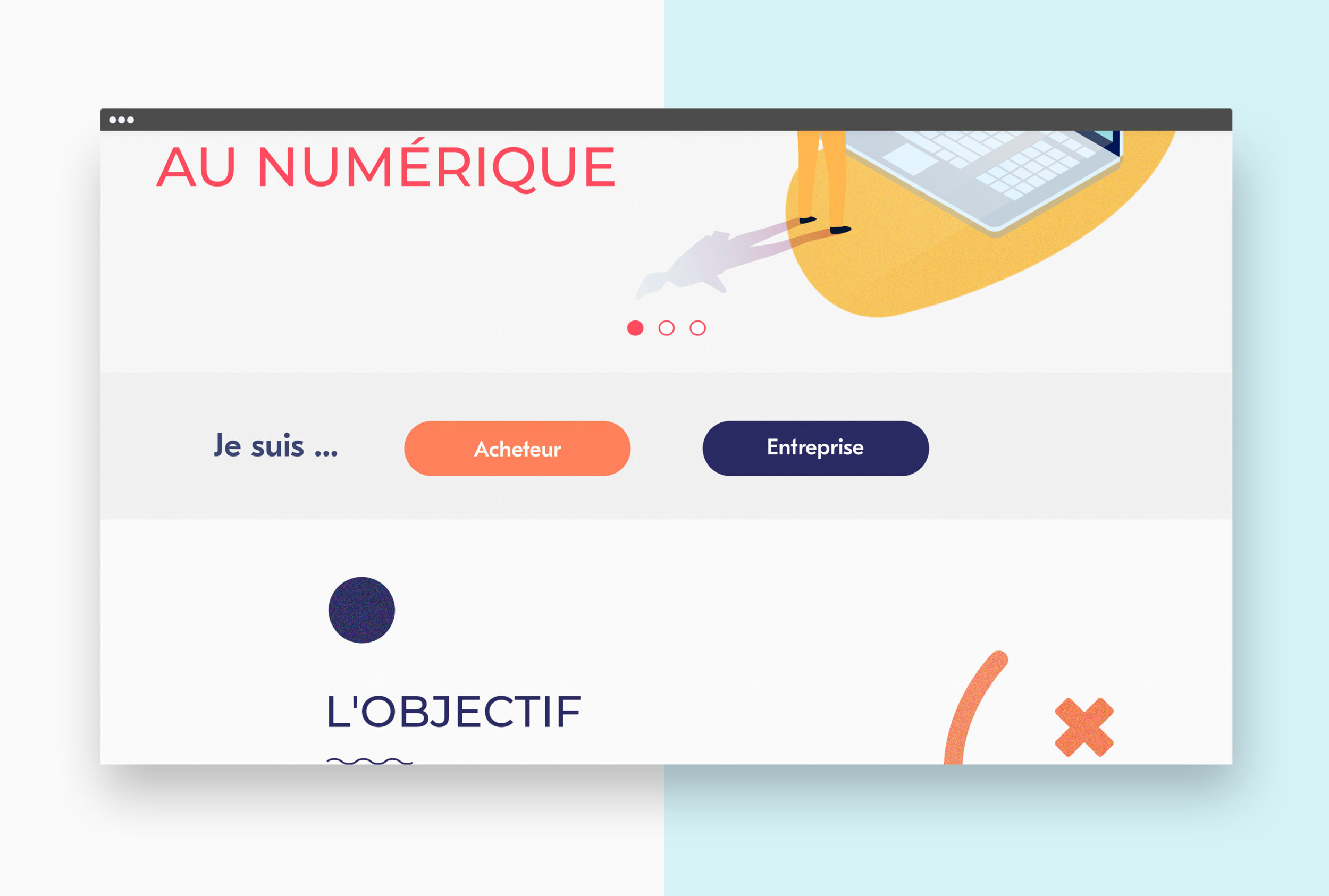
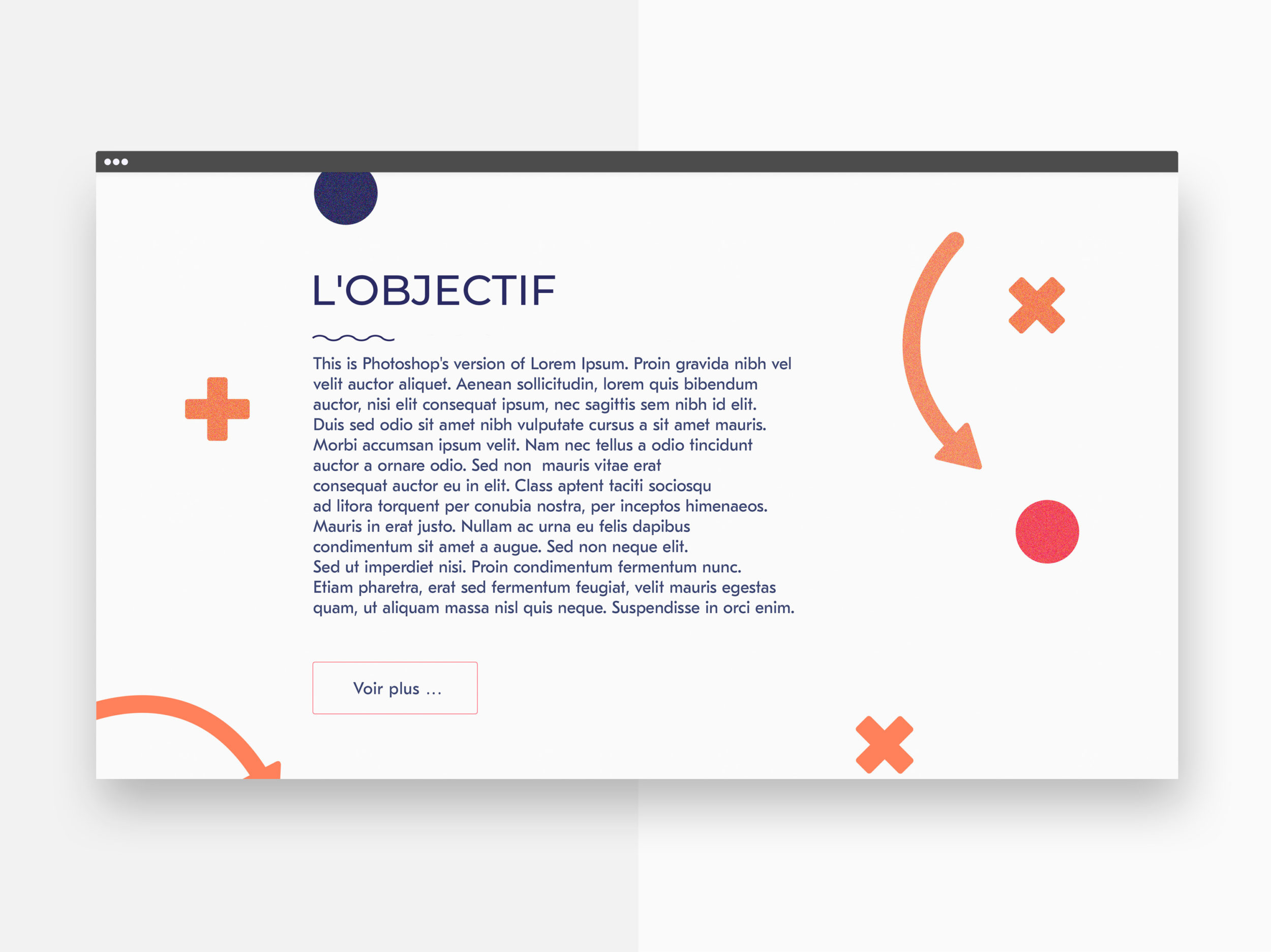
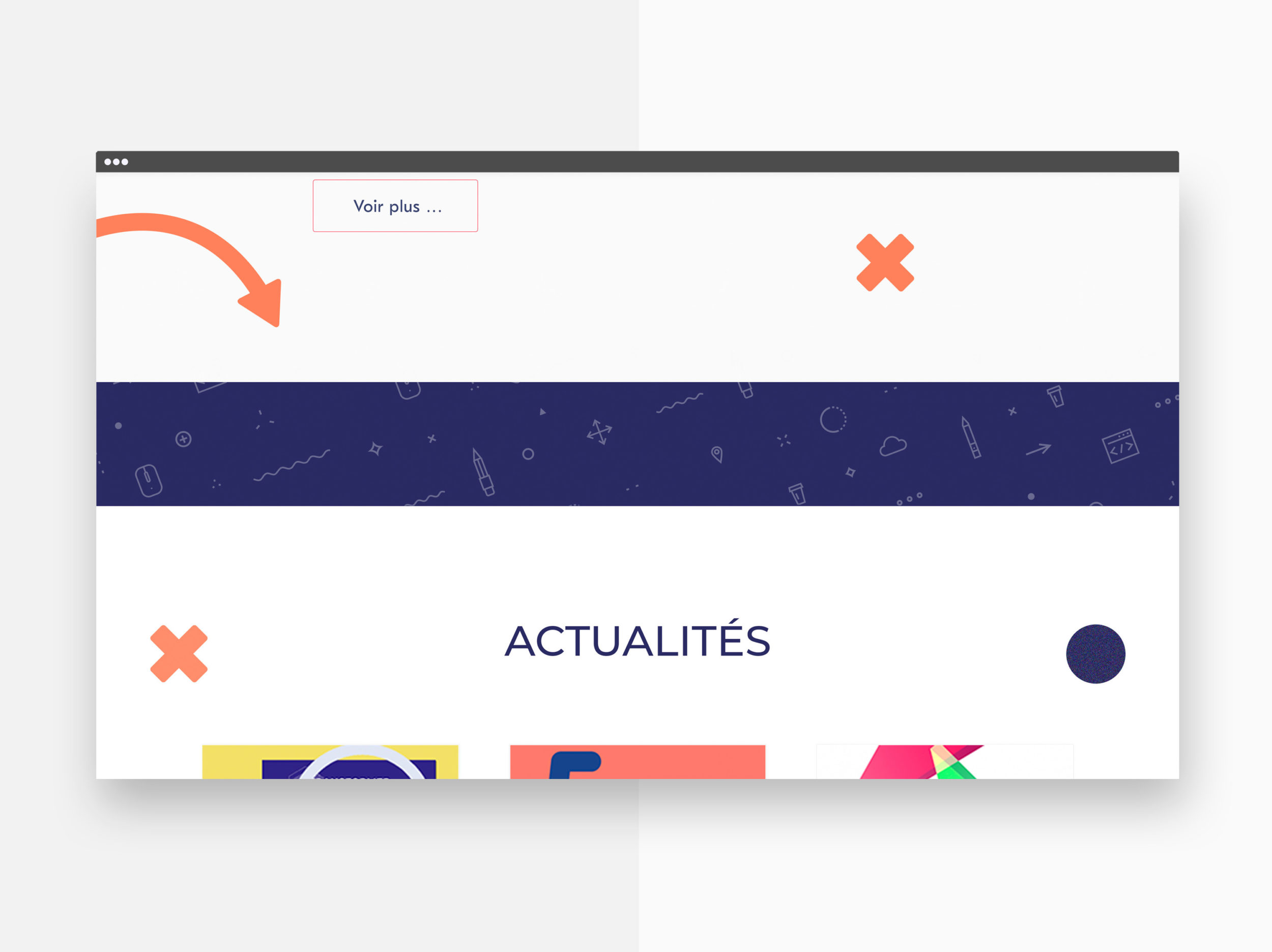
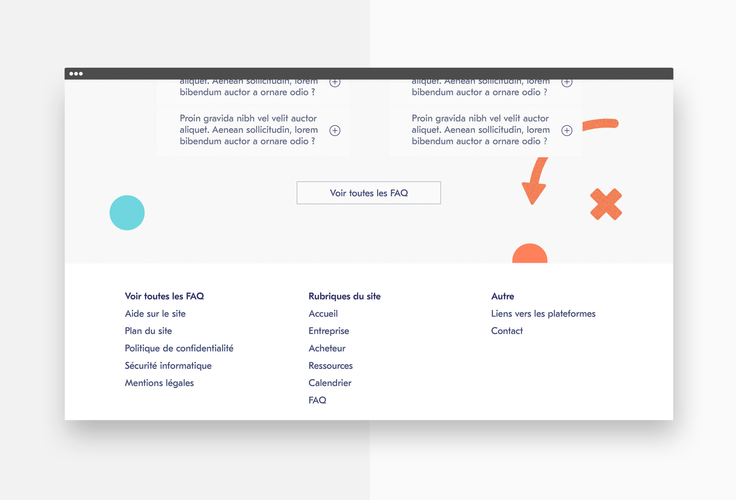
In order to ensure a smooth transition into digitisation, we paid particular attention to the platform’s user experience. Our typographic and chromatic choices aimed to emphasise legibility and to communicate information as clearly as possible.
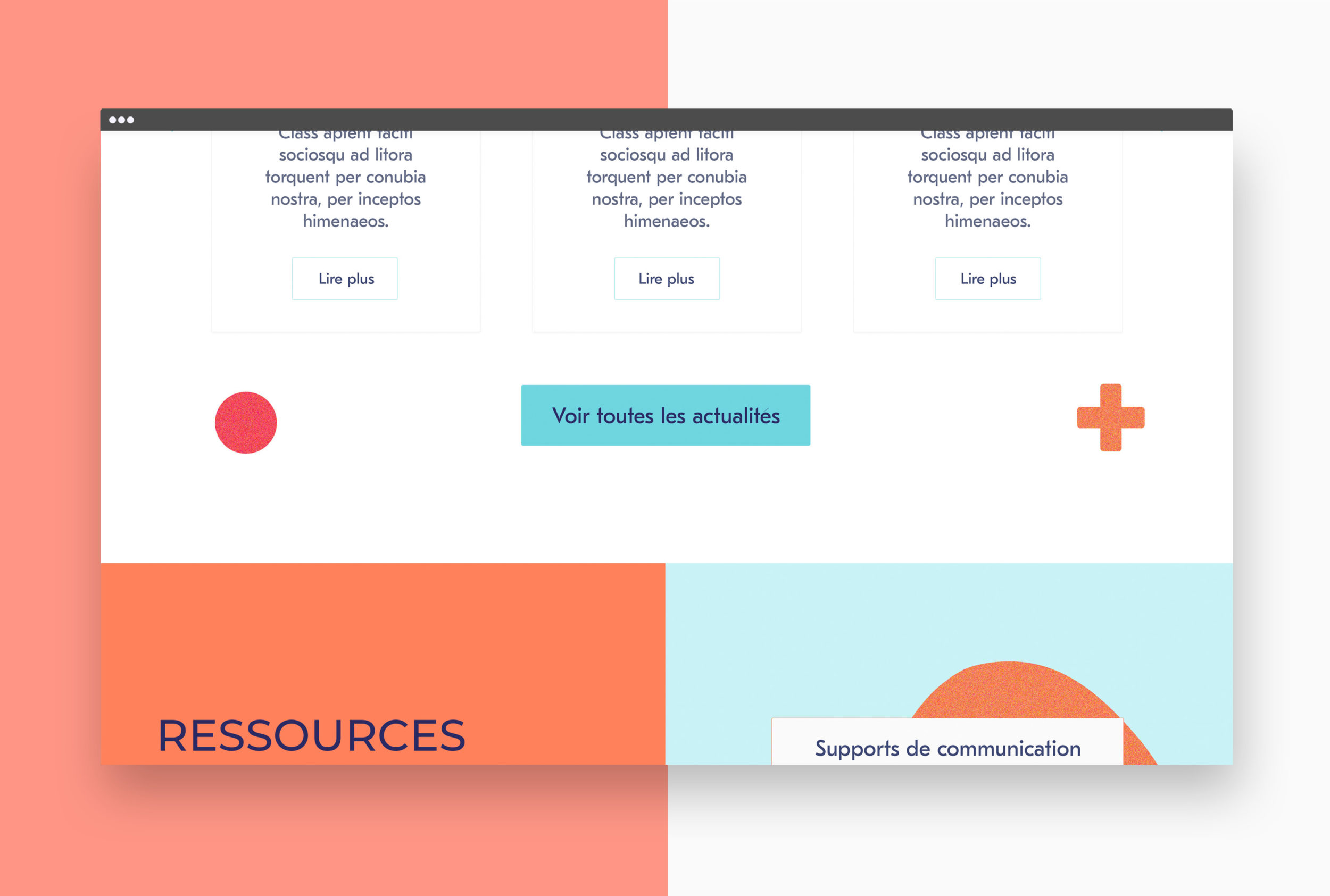
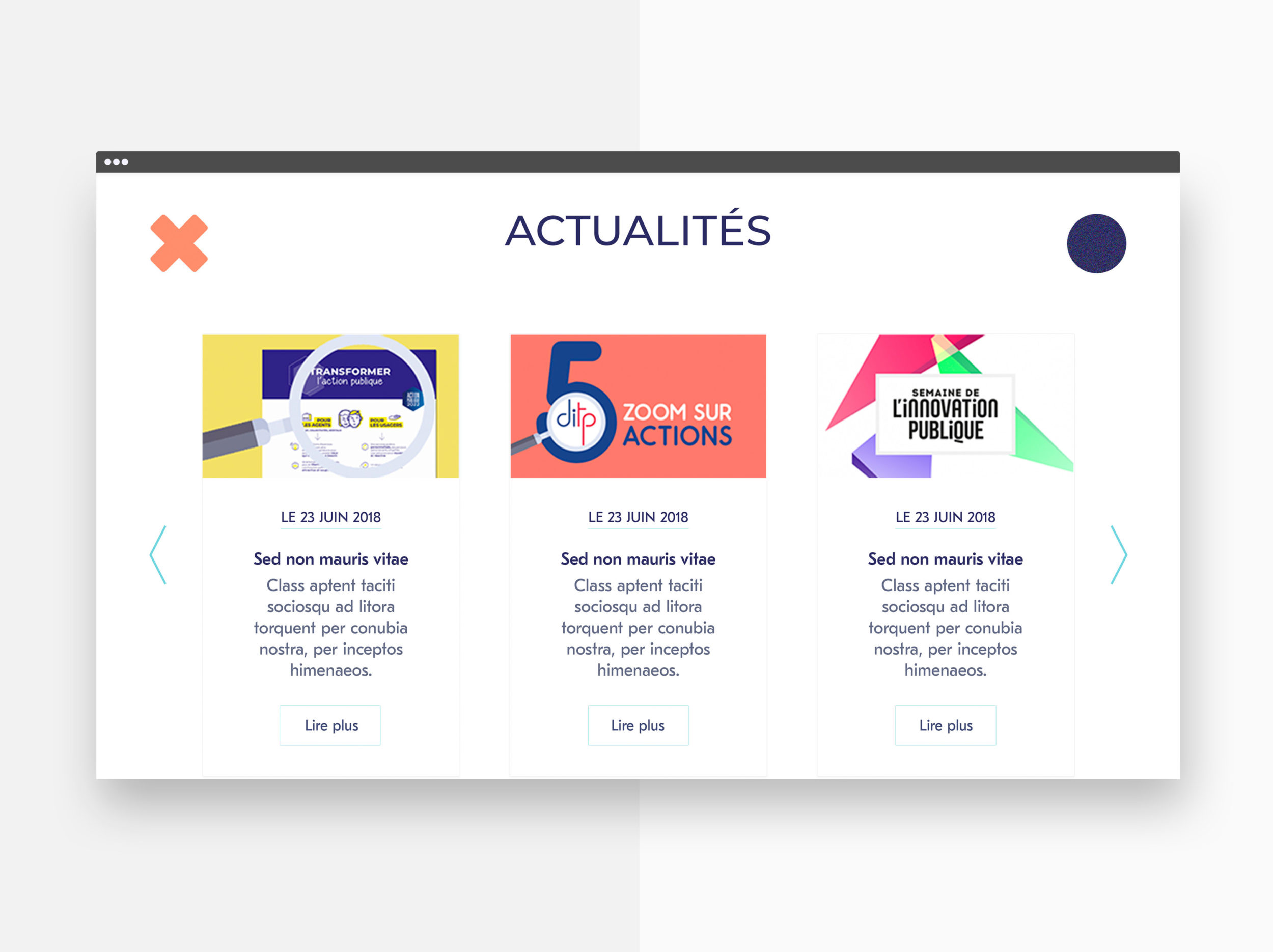
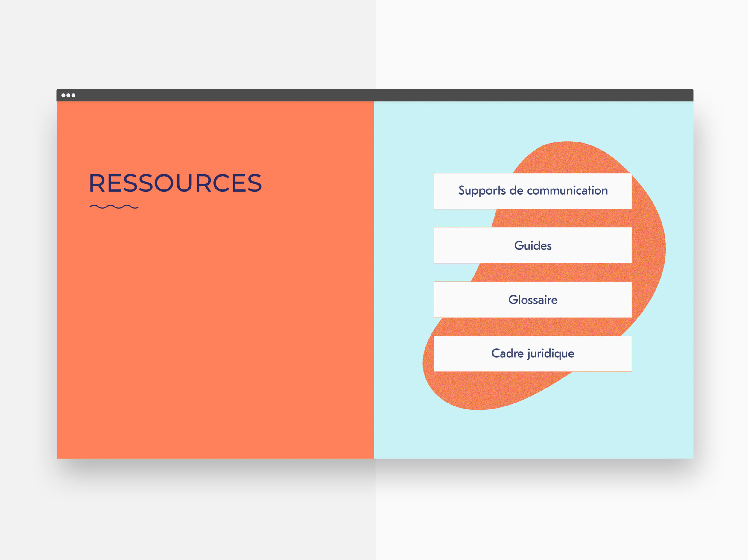
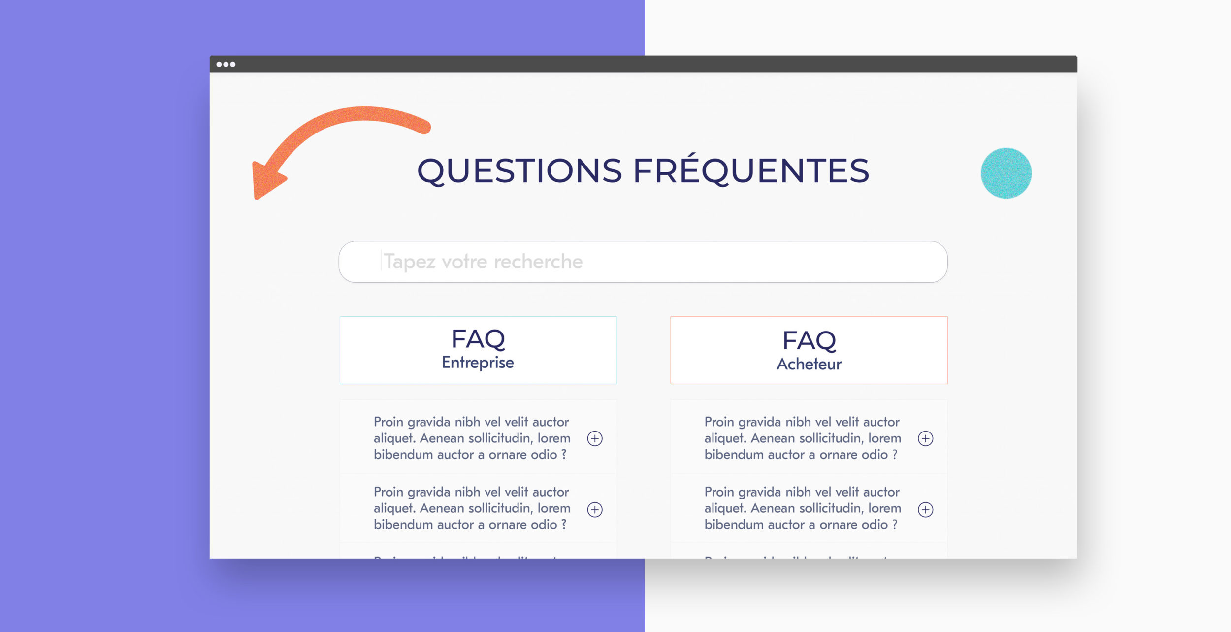
We paired soft and fluid shapes with vivid colours, and left a significant amount of white space, in order to effectively convey this message.
Project: La commande publique Categories: Visual identity, Webdesign Client: Mazars for the french Ministry of economic and finance Year: 2018